BLOG 2
Fizzy Mag
Florence and I came back to Amsterdam because of the Coronavirus. We still are doing our internship but now from home in the Netherlands. In blog 2 of my second internship with Fizzy Mag in Berlin, I will take you through my work processes. I will show you step by step what I have done and how I have done this and of course my final result of each design process. I do this twice a week so that you can follow what I do. If you have any questions you can always send a message at the bottom of the page.
DOSE
DOSE SKATEBOARDING is an independent skate magazine that shows everything about the latest skate trends and tricks. This is where I work on together with Fizzy Mag. I do their articles, Instagram, flyers, and logos.
BOARD TALK LOGO
TIME: 4 HOURS - ILLUSTRATOR
Board Talk is a series of skateboard interviews with famous skateboarders. For the videos they needed a logo that they could always use. I made it using illustrator and feedback from Brit and my colleagues.
LOGO SKETCH
B1-K1-W5
First I started looking for inspiration on Pinterest and looked at other skate brands. Then I made an Illustrator file and started sketching logos. In the meantime, Brit also had to think about what the series was going to be called, so that's why I started with Skate Talk and Board Room.

CHOOSE LOGO
B1-K1-W6
I sent all my sketches to Brit and my colleagues. These 3 logos were chosen, and I received feedback. The feedback was that I had to change the text in Board Talk because that was the new name of the series. I changed it and then they choose the best one.

DEVELOP LOGO
B1-K2-W4
They chose this logo with 2 green stripes underneath. I changed the logo to Board Talk and aligned it exactly. Then I prepared it for using and sent it to the video editor. Below a video with the end result.


DOSE FLYER
TIME: 8 HOURS - ILLUSTRATOR
For Dose brit wanted a flyer that she can hand out just like a business card but bigger. Brit had made buttons that week that she wanted to put on them. So I made a flyer where the buttons can be on to give away.
DESIGN SKETCHES
B1-K1-W5
I started by making rough sketches of what the flyer should look like. It was certain that we wanted a photo of the merchandise shoot on the back. It was taken that week so we had to wait for that. But I had already started with the position of how we wanted to put everything. With feedback from Brit, we chose this to be what we wanted.

DEVELOP & FEEDBACK
B1-K1-W6
Then we worked out everything. I did this by putting the word Dose on top of each other and it gives a crazy effect that immediately catches your eye and so you would quickly look again. Of course I had to take into the size of the buttons where I would place them. So I made the button place as a smiley because that is also the logo of Dose. And if you took the buttons off that it wouldn't be a boring black space.

DEVELOPING THE DESIGN
B1-K2-W3
Finally after a few tries, we choose everything except the typography. It was difficult to find typography that would not look too heavy but would be bold enough. In the end, we went for a sleek and calm font and the flyer is finished.

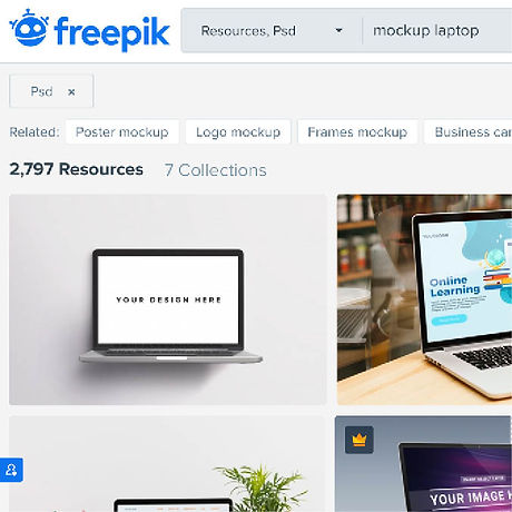
MAKE AN MOCKUP
TIME: 2 HOURS - PHOTOSHOP
I had to make a mockup for the Dose website. A mockup with a laptop, iPad, and iPhone to show the different versions of the website. This is also useful for customers and users.
SEARCH FOR AN MOCKUP
B1-K2-W1
I started to look for mockups and have been able to find them on a few websites. I found this more difficult than I thought because a lot of mockups you have to pay for. After finding 5 suitable mockups I was able to continue.
TAKE SCREENSHOTS
B1-K2-W1
Then I took screenshots of the website via a laptop and via mobile. You need to look good at the size because a mockup is usually the size of a larger laptop so I have to pull the screen of my laptop in a different way than it is the normal size. Also I have to take a screenshot 2 times and put them together to make it long enough. I also did this for the iPad.

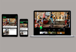
DEVELOP MOCKUPS
B1-K2-W3
I showed the mockups to Brit and she chose the 2 best. As feedback I got to change the background color and put the screenshots just a bit better. And so the end result of 2 mockups came.

 |  |
|---|
FIZZY MAG
FIZZY MAG is a next-generation women’s media company covering the latest in fashion, streetwear, music, art, beauty, and culture. This is where I work on together with Dose. I do their articles, Instagram, photo's, and a lot more of design stuff.
LAY-OUT ARTICLE
TIME: 2 DAYS - XD
I had to make a new design for a text article for Fizzy Mag. On Fizzy Mag we have many types of articles, one with more text and the others with more photos. And for the type of text article we wanted to have a new layout. A text article is an article that has a lot of text and photos, so I started working on that.
INSPIRATION
B1-K1-W3
I first looked at other types of websites to get inspiration. And I went to discuss with Brit and my colleagues what really needed to be changed and must. So I put the points in a row and I could really start.

DEVELOP & FEEDBACK
B1-K1-W6
I made an XD file, grabbed an existing article, and collected photos that I could use as an example so you could see it well. The first thing that we wanted that the top image is the size of the screen and on top of the text. Then I started with the intro on the top and then use photos to keep it playful. So I went on and showed it to Brit, her feedback was to use more photos in collage form and make the article longer for the example.

DEVELOPING THE DESIGN
B1-K2-W3
I changed it and showed it again, the feedback was to put the text differently. I also adjusted this and so we got a nice end result. Below you can see a video of the end result.


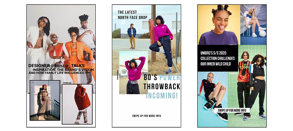
INSTAGRAM STORY
TIME: 30 MINUTES EACH - INDESIGN & INSTAGRAM
Fizzy Mag uploads many articles and to attract more readers they put the articles in their Instagram story to promote it. The Instagram stories are mainly done by my colleague Max, but because he sometimes has no time for that,
I sometimes take over. Since I made a lot of stories, I show the process of 1 Instagram story and in the end I show some of them.
PHOTOS & TITLE
B1-K2-W1
First I went to the article and saved some of the best photos and copied a good catchy sentence or the title. I mainly make the story in Indesign because you have more choice for fonts and I can make it better because doing on your mobile is very small.

DEVELOP STORY
B1-K2-W3
Then I started pasting the photos in Indesign and I chose a font that matches the style of Fizzy Mag and the article. With Instagram you have to be careful not to put the text completely below and at the top, because there are bars in front of it and then you can no longer read it well.

LAST ADJUSTMENTS
B1-K2-W4
Then I asked for feedback and received feedback to adjust the text or make the photo bigger. After the last changes, save the Indesign file and send it to your mobile. On my mobile I can go to the Fizzy Mag Instagram and place the photo in the story, in which I link the website to it and the story can be placed.

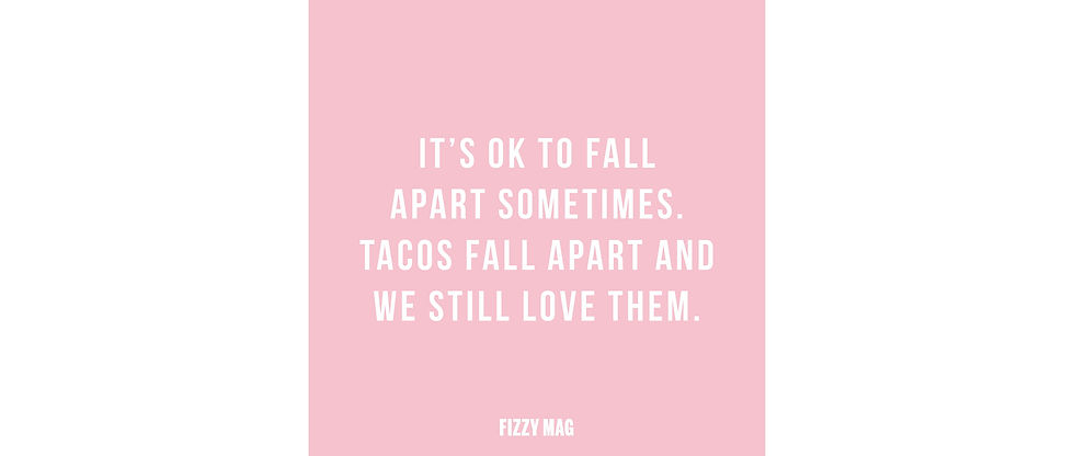
INSTAGRAM POST
TIME: 30 MINUTES EACH - INDESIGN & INSTAGRAM
Fizzy Mag is very active on Instagram and that is why there has been a schedule for a few weeks that a photo is posted at certain times. I post a photo every Wednesday at 12:00, I've posted a quote a few times and I'm going to explain how I did it.
SEARCH FOR INSPIRATION
B1-K1-W3
First I look for a good quote that fits the moment also fits Fizzy Mag. I do this on Pinterest or I look it up on the internet. On Pinterest I am also looking for a style for the quote I want to make and then I will try to translate this into Indesign.

CHOOSE FONT
B1-K1-W5
Then I started to put the chosen quote in a nice font. I chose that font because I used it more often for Fizzy Mag. And I know that it is not too manly, but solid and good to read.
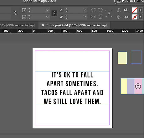
BACKGROUND
B1-K2-W3
When I determined the placement and font of the text, I continued with the background. I started making a post with 2 colors and then I continued with photo backgrounds. I received feedback to do a pink background and so I ended up with the result below.